SWORKIT
Localizing SWORKIT, a US based workout app to the Japanese market
TIMELINE
5 days
ROLE
UX Designer
UX researcher
TOOLS
Figma

OVERVIEW
Understanding the Sworkit Application
Tasked with localizing the Sworkit application for the Japanese market, I focused on understanding both the app's functionality and the cultural nuances of Japan. Sworkit is a mobile fitness app that enables users to target specific areas of their body, set workout durations, and track progress. It offers customizable workout routines and helps users achieve their fitness goals.
The importance of localization
This localization to Japan is important because it allows for Japanese users to feel as if the creators had a deep understanding and appreciation for the cultural norms and lifestyle practices. Japan has a unique set of societal norms and daily values that influence their individual fitness and health journey, differing heavily from the originally US oriented app. By being able to adapt SWORKIT, I am able to cater to the local behaviors allowing the app to be more relevant and usable by Japanese users.
Analyzing the Current application

IDENTIFYING THE CHALLENGE
Bridging the Cultural Gap
Sworkit, a fitness app designed for English-speaking users, currently caters to an American audience with minimal consideration for cultural differences. This creates a barrier for Japanese users, who may have distinct needs, preferences, and expectations. The challenge is to redesign the app to align with the Japanese market’s cultural and functional expectations, ensuring a seamless and relevant user experience.
UNDERSTANDING THE CULTURE IN JAPAN
What I learned
At this stage in my process, I had to truly understand the lifestyle and workout culture in Japan. Their culture and lifestyle significantly influence their workout regimen.
High Physical Activity: Despite low gym membership rates, Japan maintains high levels of physical activity, contributing to one of the world's lowest obesity rates

Daily Integration: Even with demanding work schedules, Japanese residents incorporate exercise into their routines by walking to various destinations, including school, grocery stores, and work.
Group-Oriented Activities: In collectivist societies like Japan, there’s a strong emphasis on group harmony and shared experiences. This translates into fitness culture, where exercising together is common, whether through corporate wellness programs, school routines, or community fitness groups.
STARTING THE DESIGN PROCESS
Color scheme
To create a culturally relevant experience, I adapted the app's color scheme to resonate with Japanese values and aesthetics. Colors carry significant cultural meanings, influencing how users perceive and connect with a design.

Translation
Since I was not accustomed to the Japanese culture, researching was a very vital part in my design process. All my designs have been translated to Japanese, in which it has been crossed checked with multiple individuals who are fluent in Japanese in order to ensure the right phrases and spelling was used.
THE DESIGNS
Categories for cultural preferences
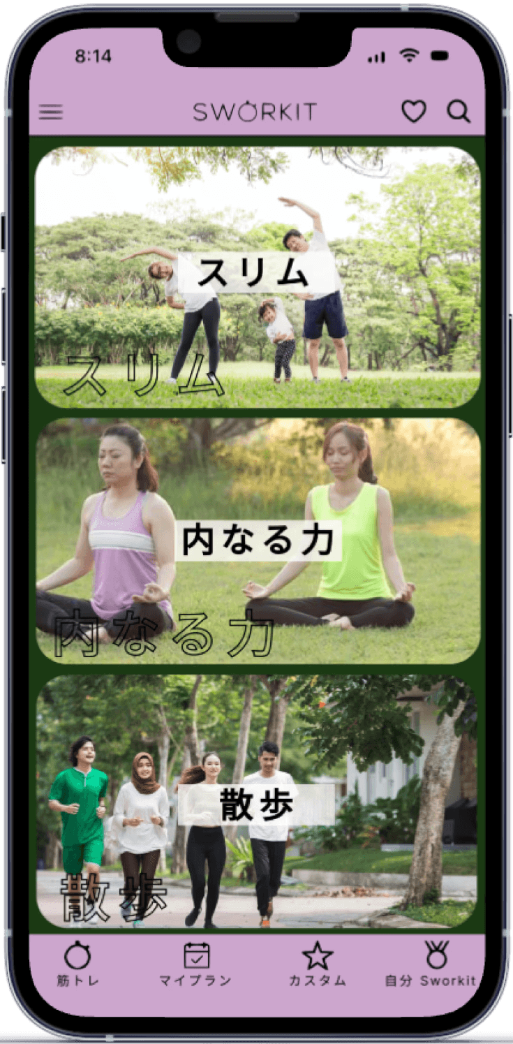
Since the app resonated more with western goals, I had to change it to align with the Japanese exercise preferences. Factoring in the desired beauty standards such as small waistline, small hips, and slim legs.
To do this I have changed my categories to exercises that favor a more lean physique rather than building bulk muscle. My new categories (in Japanese) are leaner, inner strength and walking.


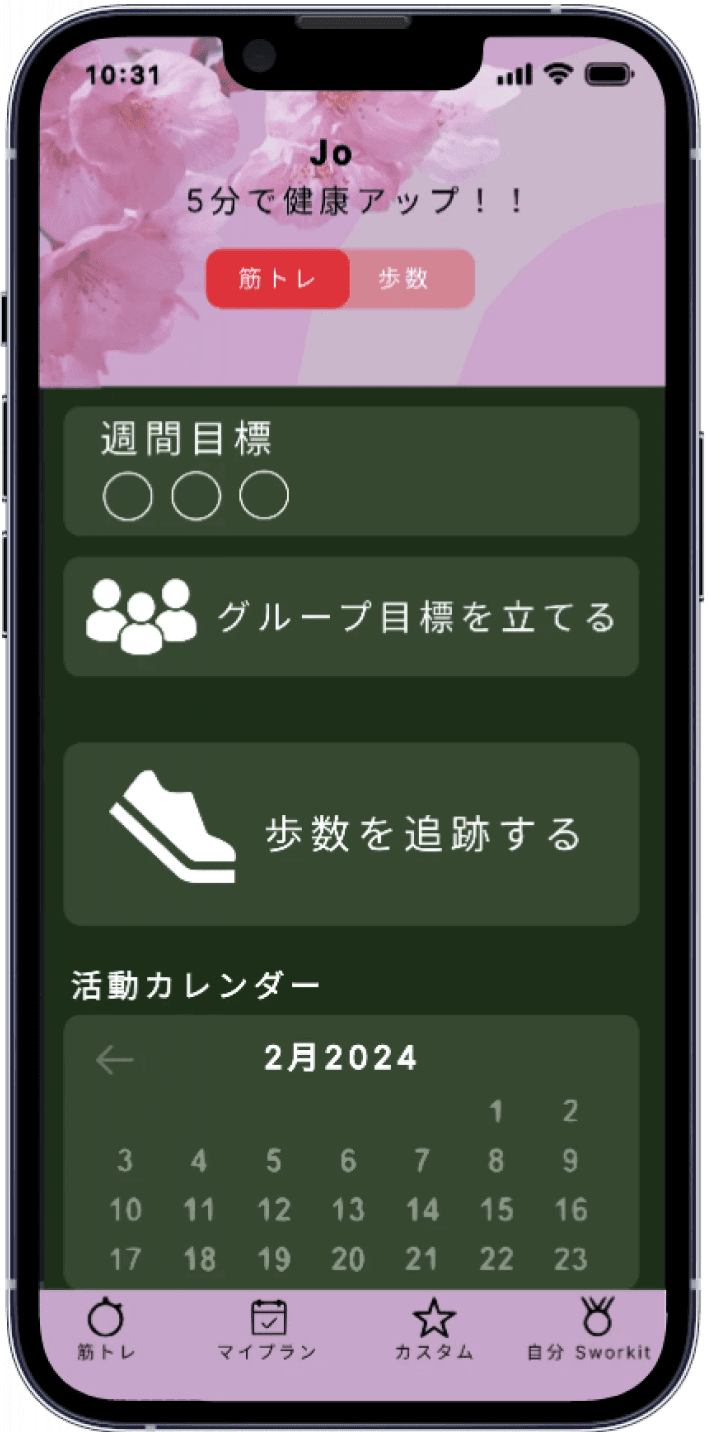
Goal Tracking
Recognizing walking as fundamental in Japanese life, I redesigned the app to emphasize step tracking directly within it, changing “connect to a step source” to “track your steps” to avoid external apps.
Additionally, to reflect Japan’s collectivist culture, I added options for users to set group goals alongside individual ones, fostering motivation through shared objectives.
Warm Up
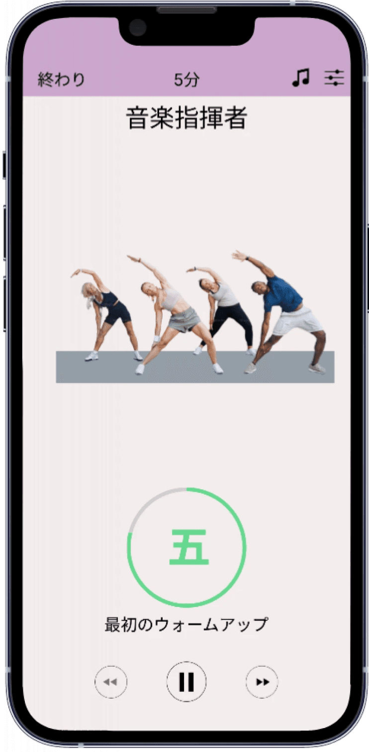
In Japan’s collectivist culture, harmony is valued over individualism. Replacing individual photos with group images fosters a sense of collective achievement and motivation, better resonating with Japanese users.
Additionally, I maintained a minimal design to align with Japan’s preference for simplicity.

REFLECTION
Challenges
Localization came with significant hurdles—verifying information without firsthand experience in Japan and overcoming the language barrier. While I couldn’t personally confirm every insight, collaborating with a Japanese-speaking friend became a vital part of ensuring culturally appropriate translations.
Research and Adaptation
To bridge these gaps, I conducted extensive research on Japan's design aesthetics, cultural values, and fitness demographics. This process allowed me to align SWORKIT’s features and visuals with Japanese fitness culture, making the app feel authentic and relevant to its audience.
Lessons Learned
This experience highlighted the importance of collaboration and designing with cultural sensitivity. Localization is more than translation—it’s about crafting a product that resonates deeply with users. By adapting SWORKIT to reflect these principles, I created an app that truly speaks to the Japanese market’s needs.